#designated walkway
Explore tagged Tumblr posts
Photo

Exterior - Stone Large trendy brown two-story stone exterior home photo with a metal roof
0 notes
Photo

Brick - Exterior Example of a large classic beige two-story brick exterior home design with a shingle roof
0 notes
Photo

Traditional Landscape in Toronto Photo of a large traditional full sun backyard brick landscaping in summer.
0 notes
Photo

Mid-sized trendy two-story mixed siding exterior home photo
#Mid-sized trendy two-story mixed siding exterior home photo large glass windows#blue siding#designated pathway#second floor balcony#red siding#second floor roof porch#designated walkway
1 note
·
View note
Photo

Porch Side Yard in Chicago
#An elegant stone side porch in the middle of the frame#with a roof extension outdoor patio#stone siding#cased opening#pendant lantern#stone exterior#designated walkway#covered patio
0 notes
Text

The Cottage Book, 1989
#vintage#interior design#home#vintage interior#architecture#home decor#style#1980s#80s#entrance#front door#cottage#brick#walkway#garden#landscape design#Berkeley#California#Maybeck
446 notes
·
View notes
Text

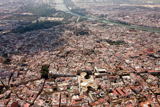
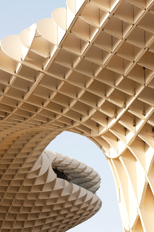

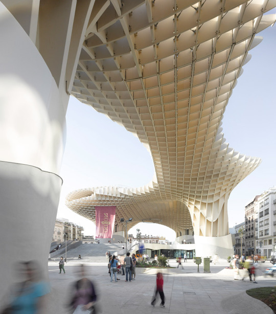
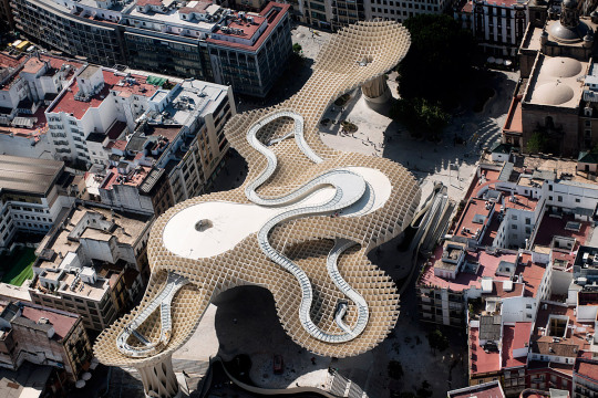
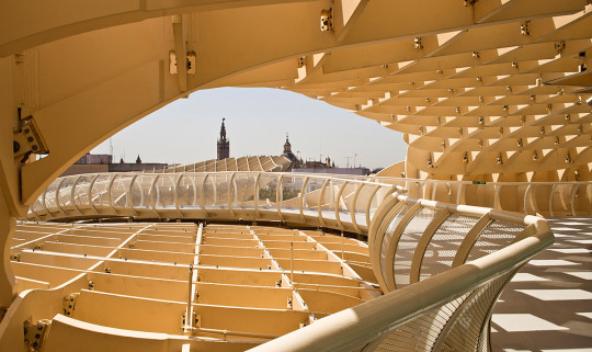
Metropol Parasol, Seville - J. Mayer. H
#J. Mayer. H#architecture#design#building#modern architecture#concrete#steel#walkway#parasol#public space#town square#public square#light#organic#parametric#cool architecture#amazing places#old and new#sevilla#spain
822 notes
·
View notes
Text
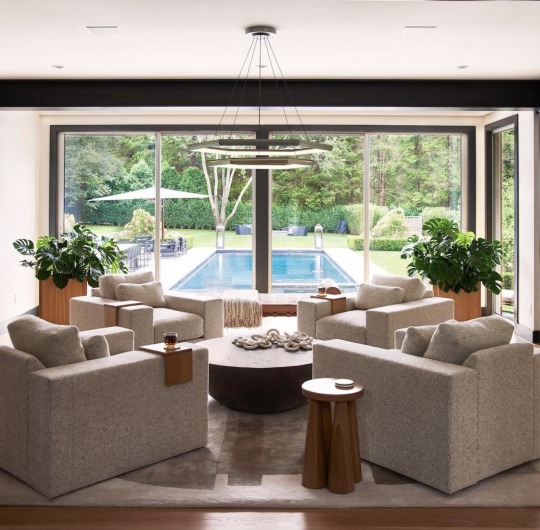
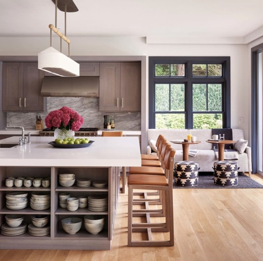
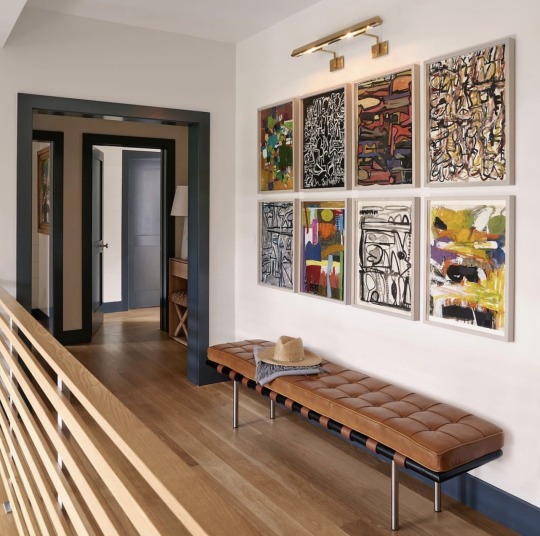
jougestudios
#soft contemporary#interior design#open staircase#walkway#contemporary art#gallery#kitchen#dinette#cocktail tables#swimming pool
51 notes
·
View notes
Text
before.

#graphic design is my passion :D *dies*#i sacrificed my firstborn son for this#the yellow and orange beam/ray/walkway is a polarized glass floor btw in case anyone was wondering. nobody was? too bad.#also thanks to a few friends for their eyes for this LMAO#this is inspired by obviously the resistance cover and also two 1984 covers#i also know the song is in the past tense in the book since the point is you only really realize what it means afterwards#but since i tried to give a sort of before the fall version here its in the future tense#this is the graphic design equivalent of [random radio and tv transmissions broadcast on march 29th 2012 between 18:48 and 19:10] btw#muse band#resistance era#1984#george orwell#YES IM SORRY IM TAGGING THIS LMFAO
8 notes
·
View notes
Text
Hey, I know this blog is about knitting and the people following me would like to see knitting stuff, or so I guess. But I'm also a transportation engineer and urban planner by day and there is a lot of cool stuff out there that I thought some of you might want to see.
Therefore, HIGH LOOP be upon ye (image is clickable and takes you to the project website):
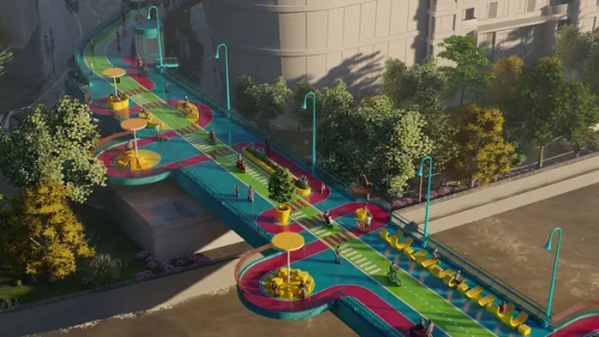
This is the Puji Road Bridge in Shanghai, that is supposed to be transformed into an elevated park "offering a unique urban journey". It connects the districts of Zhabei and Jing’an. From an architectural point of view, this walkway is fun, creative and has a unique and interesting aesthetic. The different colors are supposed to indicate different functionalities. Yellow indicates social activities like sitting and chatting or gastronomy. Magenta areas are supposed to invite the pedestrians to meander and enjoy the view of the river and cityscape. Green is a fast lane for scooters and bikes. And blue is just the background color and space for pop-up stores or event space. Cool cool....
I had to do a bit of digging around on google maps, but this is what it currently looks like and on the other side what it is supposed look like one day:
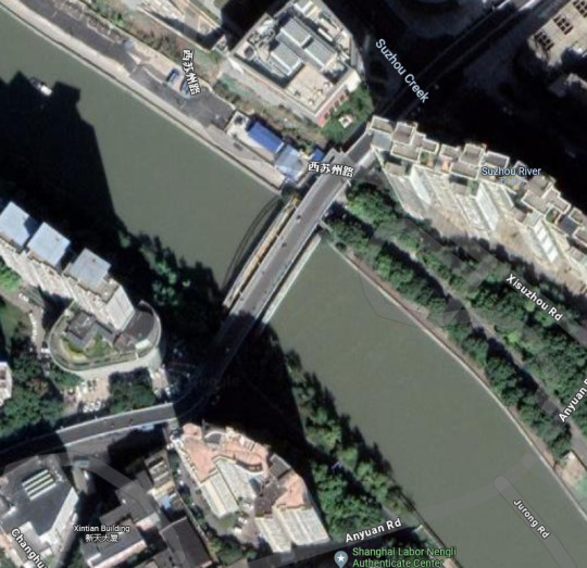
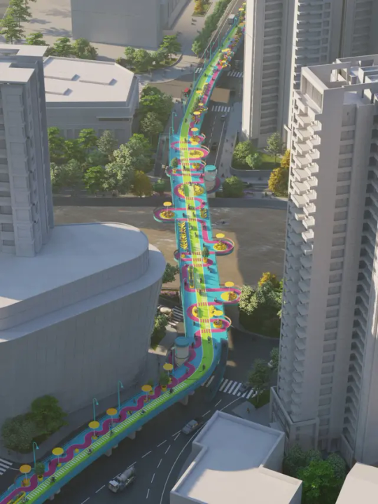
Except, from a transportation engineering perpective this thing is a nightmare!!! You wanna know why? Safety and order! Three things are just going to cause lots of issues and that are the colors, the road markings and the assigned spaces for the different groups of road users and the way they mingle.
The following is not supposed to be bashing cool new concepts for the fun of it, but is based on serious knowledge and experience from a professional and practical point of view.
We know from experience and recent research, how pedestrians decide where to walk. For example by sending them through a virtual reality environment or using eye tracking technology in the real world. Generally they are the ones most sensitive to detours, because they are the slowest group of road users. So, red is for pedestrians? Imagine being the wheelchair user or their companion in the lower right corner of the picture, having to walk the red line:
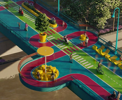
First of all, noone in their right mind is going to do that, not even when taking a walk and taking in the scenery. That's going to take forever.
Secondly, we know that pedestrians as well as any other participant in traffic need some kind of visual aid to know, what their designated space to use is, where does other participants' space begin and end etc. Even on streets dedicated to cars only, we need a division in lanes, as soon as a certain width is reached. That creates a feeling of safety and also gives people a general sense of order (which is what the brain wants in almost all kinds of situations in life). Usually in urban and transportation planning we try to work with axes. This bridge, I don't even know where to place this in terms of axes. There is not a single axis. You have to change direction all the time or you bump into something. Everything is all over the place. Look how many times the different paths cross. And then they want to let city scooters drive there? And what is that green line in the middle of the road? The murder lane? Dissecting the entire space into three parts, so you have to cross even more times, from left to right, from the yellow sun loungers on the right to the yellow sitting area on the left (which is probably catering or a pop-up store or whatever), from one view point to the sitting area? There are these flower pots (seemingly random), sometimes round, sometimes oblong. And people walking on the blue parts???? Which are dedicated to what exactly?? Just think of how annoying it is to walk somewhere and having to bypass even the smallest obstacle, inconveniently placed.
Lastly, no road marking on the entire thing looks like established standards. Most people don't even know the meaning of road markings, they don't see very often. Let alone something they have never seen before. What is the difference between the red and the white dashed line? Why is the white one left and then right on the fast lane? Why does it stop and start again in the middle of nowhere? Does it make a difference for me and my scooter, where the white stripes are? Where do the bikes go, whre the scooters? What if you are faster and have to overtake? And why do the stripes suddenly stop and the regular doted line divides the lanes?
I dream of this design at night and wake up crying. But it's fun to look at.
12 notes
·
View notes
Text
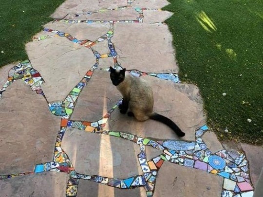
#outdoors#pathway#cat#walkway#stone#mosaic#architecture#landscape#backyard#patio#design#creative#home decor#decor#exterior#yard#nature#naturecore#kitty#cats of tumblr#cute cats#cute animals#fairy#fairycore#fairy aesthetic#cottagecore#cottage aesthetic#cottage core#plants#aesthetic
29 notes
·
View notes
Text

just.... wanted to draw some of the cute s/is ive come across recently
@oh-gh0st @yosomats @ichikos
#osomatsu san#ososan#osomatsu san self insert#osomatsu san oc#my art#spice.ososan#uhhhhhhhh like i said in the image i hope i didnt butdher them too bad......#ur guy's designs are very cute and good and i just wanted to draw them and stuff i hope thats ok#mao#ok just imagine im like ringing ur doorbell and placing these at yr doorsteps#and i turn around to run away so you dont see me but i like trip halfway down the walkway#and u open the door JUUUUST in time to see me eat shit on the pavement#anyway i wanna draw more s/is and i prolly will
56 notes
·
View notes
Text
imagine if i owned a house and i designed and fired a bunch of unique ceramic tiles and retiled the whole bathroom with them (<- statements dreamed up by the utterly deranged)
objectively it would be a huge time and money sink just to. yknow. severely lower the resale value of the house. but oh my god it would be so so so cool
#not my fault the average american apparently has the interior decorating sense of paperclip#i dont think ill ever be able to afford a house anyways so it doesnt matter#while were fantasizing lets make it a fancy japanese style bath with a large open shower area and a big separate tub for soaking#with temperature controls for the room and the tub water... waow#some kind of grippy walkway and a bar along the wall to the shower#imagine if i could design a house that was stunningly beautiful but never sacrificed an inch of accessibility for it
4 notes
·
View notes
Text
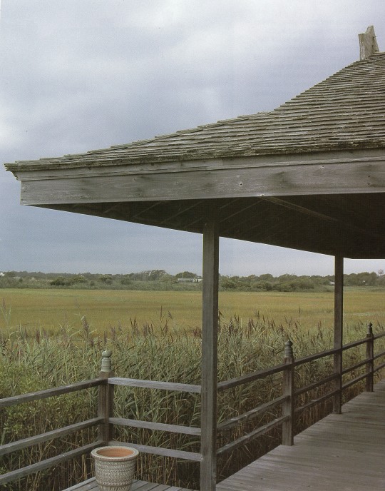
At Home With Japanese Design: Accents, Structure and Spirit, 1990
#vintage#vintage interior#1990s#90s#interior design#cupola#walkway#deck#marsh#grass#railing#Japanese#style#home#architecture
543 notes
·
View notes
Text


Elion-Hitchings Building, North Carolina, USA - Paul Rudolph
Photography by Iwan Baan
#Paul Rudolph#architecture#design#building#modern architecture#interiors#minimal#concrete#modern#modernist#brutalism#concrete architecture#cool design#space age#angles#steel#headquarters#classic#timeless#amazing places#atrium#walkways#staircase#light and shadow#design blog#architectural photography#trees#north carolina#usa#american architecture
118 notes
·
View notes
Photo
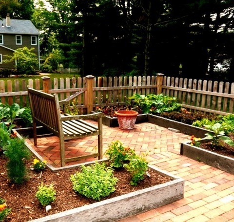
Landscape Philadelphia Inspiration for a mid-sized traditional partial sun backyard brick vegetable garden landscape in summer.
12 notes
·
View notes